
In today’s digital world, your website is often the first impression your business makes. It’s your virtual shop front, your online salesperson, and your brand ambassador all rolled into one. But a beautiful website isn’t enough. To truly succeed, your website needs to be user-friendly.
A user-friendly website design focuses on creating a positive and intuitive experience for your visitors. It’s about making it easy for them to find what they need, understand your message, and take the desired action, whether that’s making a purchase, filling out a contact form, or simply learning more about your business.
But why is user-friendliness so crucial? Because a website that’s difficult to navigate or frustrating to use will drive visitors away – potentially straight to your competitors. On the other hand, a user-friendly website can lead to increased engagement, higher conversion rates, and a stronger brand image.
In this post, we’ll explore five essential elements of a user-friendly website design that can significantly impact your online success. Let’s dive in!

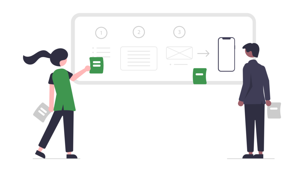
1. Clear and Intuitive Navigation
Imagine walking into a shop with no signs, no aisles, and products scattered haphazardly. You’d probably turn around and leave, right? The same principle applies to your website. Clear and intuitive navigation is the backbone of a user-friendly experience.
What makes navigation user-friendly?
- Logical Structure: Your website’s information should be organised in a logical and hierarchical manner. Think about the main categories and subcategories that make sense for your business and your audience.
- Descriptive Labels: Use clear and concise labels for your navigation menu items. Avoid jargon or overly clever terms that might confuse visitors. “Services,” “About Us,” and “Contact” are generally good starting points.
- Consistent Placement: Your main navigation menu should be consistently placed on every page, typically at the top or along the left side of the screen. This helps users quickly orient themselves no matter where they are on your site.
- Limited Menu Items: Don’t overwhelm users with too many choices. Aim for a concise main menu with 5-7 primary navigation items. Use drop-down menus for secondary levels if necessary.
- Search Functionality: For larger websites, a prominent search bar is essential. This allows users to quickly find specific information without having to browse through multiple pages.
Why it matters for conversions: Easy navigation allows users to find what they’re looking for quickly and effortlessly, leading them closer to their desired goal (and your conversion goal).
2. Fast Loading Speed: Every Second Counts
In the fast-paced digital world, patience is a rare commodity. Slow-loading websites are a major source of frustration for users, and they can significantly harm your business. Studies have shown that even a one-second delay in page load time can result in a significant drop in conversions.
Factors that impact website loading speed:
- Image Optimisation: Large, unoptimised images are a common culprit. Compress your images without sacrificing quality to reduce their file size.
- Server Performance: A reliable hosting provider with fast servers is crucial.
- Code Optimisation: Clean, efficient code loads faster than bloated or poorly written code.
- Caching: Browser caching stores website data on a user’s computer, so the page loads faster on subsequent visits.
- Minimise HTTP Requests: Reduce the number of elements your website needs to load (images, scripts, stylesheets) by combining files and using CSS sprites.
Tools to test your website’s speed:
- Google PageSpeed Insights: A free tool that analyses your website’s performance and provides specific recommendations for improvement.
- GTmetrix: Another popular tool that offers detailed performance reports and actionable insights.
Why it matters for conversions: A fast-loading website provides a seamless user experience, keeping visitors engaged and encouraging them to explore further.
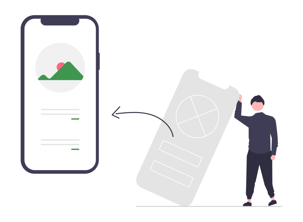
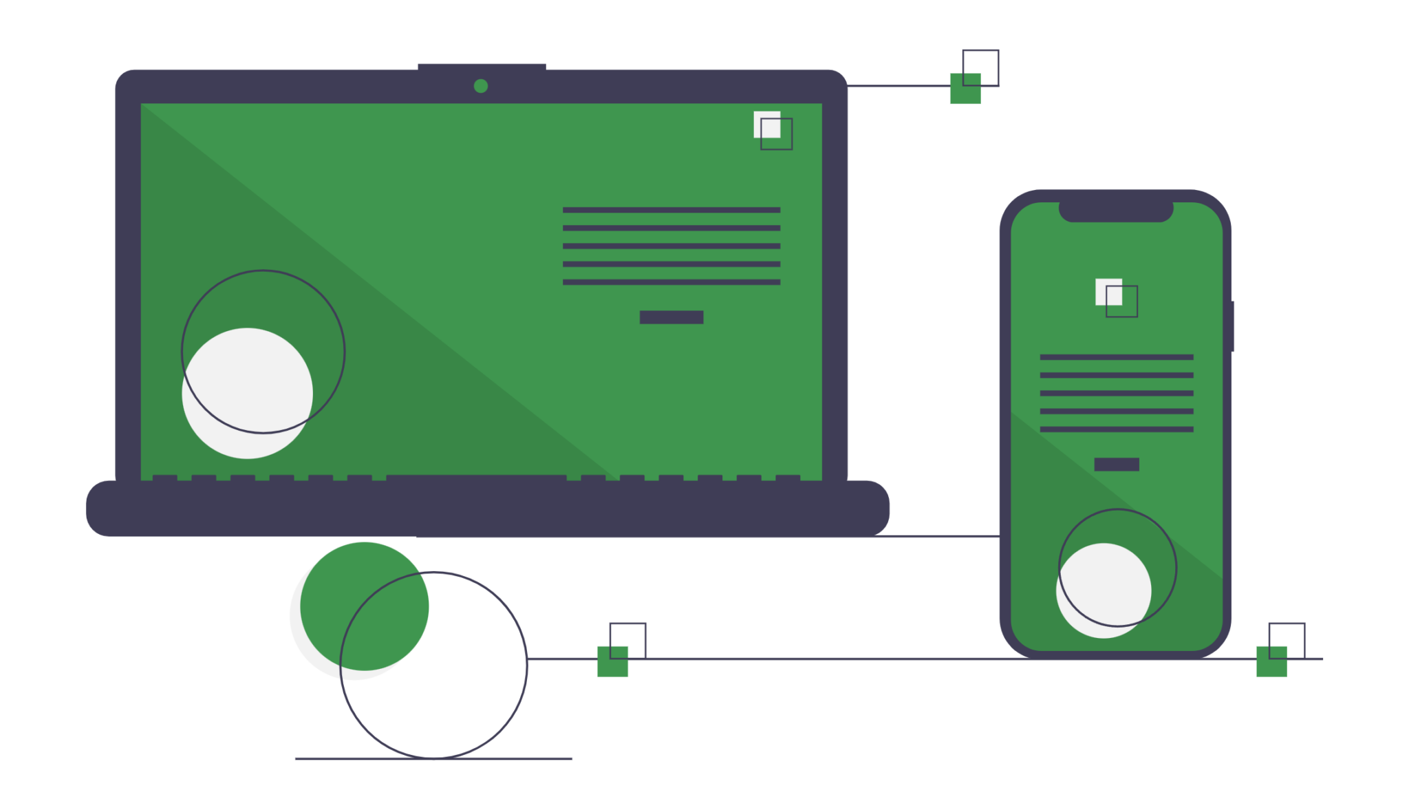
3. Mobile-First Design: Embrace the Mobile Revolution
More people access the internet through their mobile devices than through desktop computers. This means that having a mobile-friendly website is no longer optional – it’s essential. But going beyond just “mobile-friendly,” adopting a mobile-first approach is now considered best practice.
What is mobile-first design?
Mobile-first design means designing your website for mobile devices first and then scaling up for larger screens. This approach ensures that your website provides an optimal experience for the majority of your users.
Key elements of mobile-first design:
- Responsive Design: Your website should automatically adjust its layout and content to fit any screen size, from smartphones to tablets to desktops.
- Touch-Friendly Navigation: Use large, easily tappable buttons and links.
- Simplified Content: Prioritise the most important information and present it in a concise and easy-to-read format.
- Fast Loading Times: Mobile users often have limited data plans and may be on slower connections, so fast loading speed is even more critical.
Why it matters for conversions: A mobile-first design ensures that your website is accessible and usable for the vast majority of your audience, maximising your potential reach and conversion opportunities.
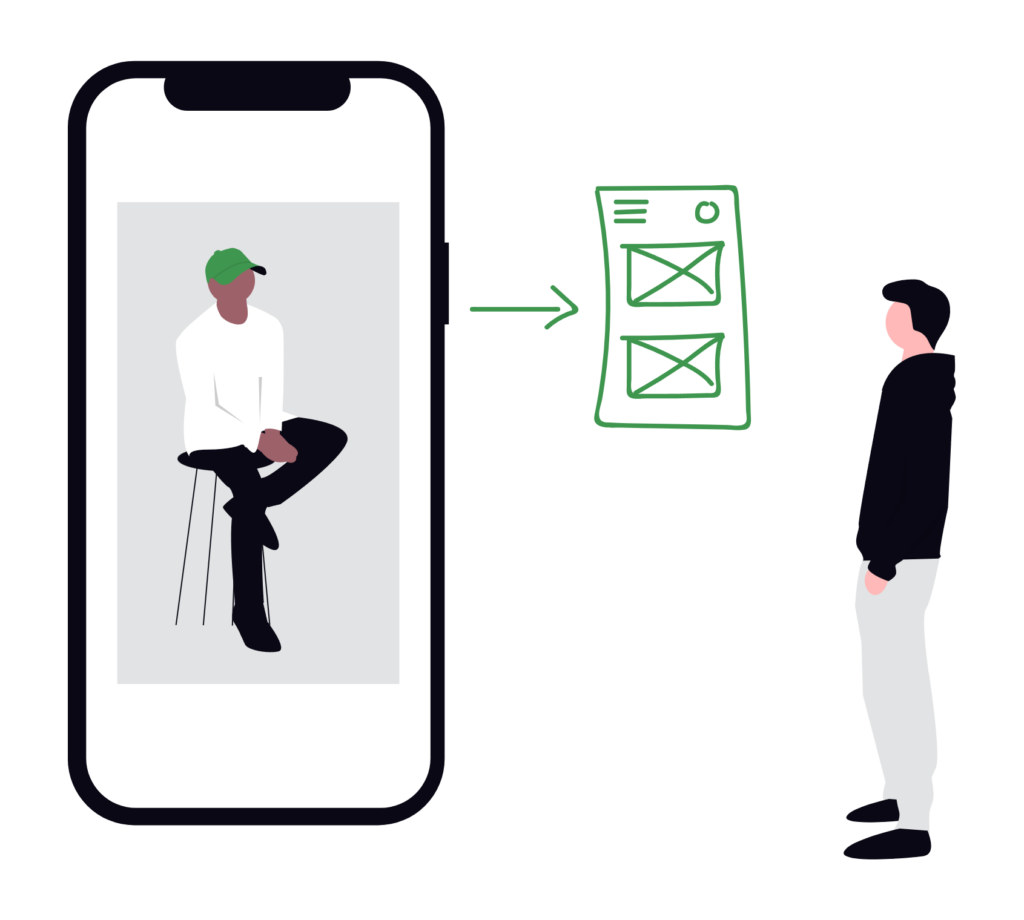
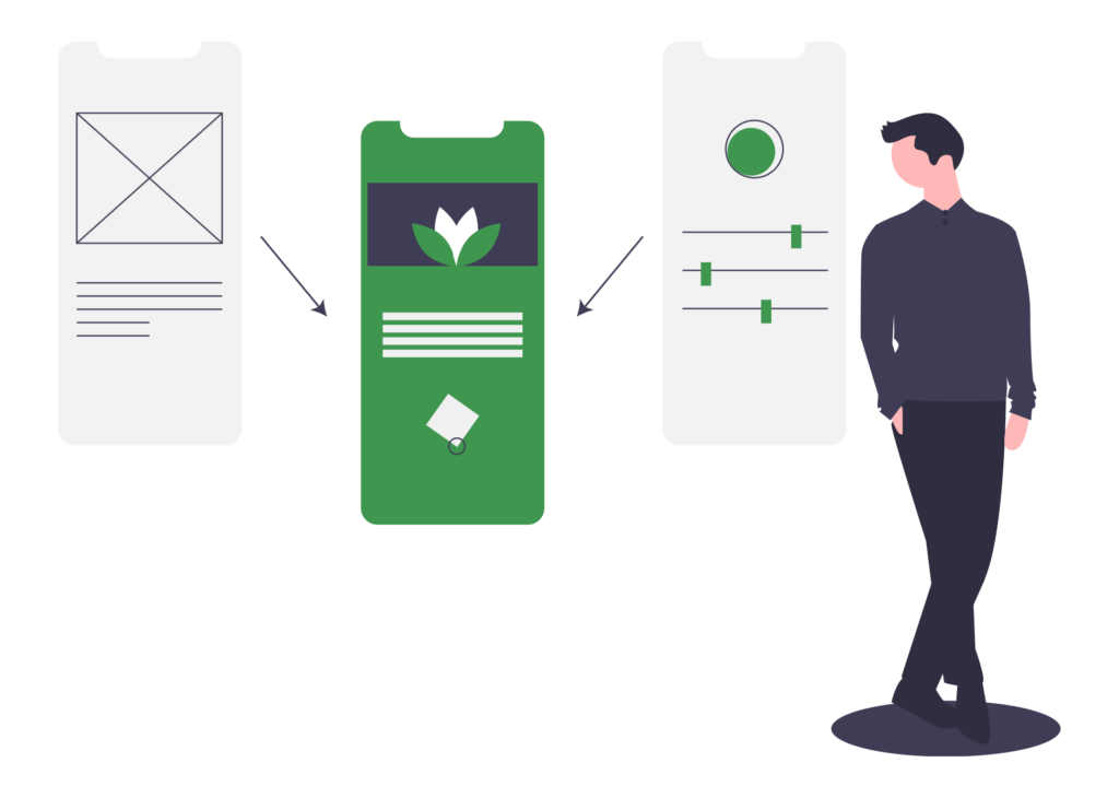
4. Intuitive Layout and Visual Hierarchy
A well-designed layout guides the user’s eye through the page, highlighting the most important information and creating a clear visual hierarchy. This not only makes your website more aesthetically pleasing but also enhances usability and comprehension.
Principles of intuitive layout and visual hierarchy:
- Whitespace (Negative Space): Don’t be afraid to use whitespace. It gives your content room to breathe and makes the page less cluttered and easier to scan.
- Visual Cues: Use headings, subheadings, bullet points, images, and other visual elements to break up text and highlight key information.
- Contrast: Ensure sufficient contrast between text and background colours to improve readability.
- Font Choice: Select fonts that are easy to read on screen. Use a limited number of font families to maintain consistency.
- Alignment: Properly aligned elements create a sense of order and make the page more visually appealing.
Why it matters for conversions: A clear and intuitive layout helps users quickly understand your message and find what they’re looking for, leading them towards your desired conversion goals.
5. Accessible Design: Inclusive for Everyone
Website accessibility means designing your website so that it can be used by people with disabilities, including visual, auditory, cognitive, and motor impairments. It’s not only the right thing to do, but it also expands your potential audience and can even improve your SEO.
Key aspects of accessible website design:
- Alt Text for Images: Provide descriptive alt text for all images so that screen readers can convey the image’s content to visually impaired users.
- Keyboard Navigation: Ensure that all interactive elements can be accessed and used with a keyboard alone.
- Colour Contrast: Use sufficient colour contrast between text and background to make it readable for people with low vision.
- Captions and Transcripts: Provide captions for videos and transcripts for audio content.
- Clear and Simple Language: Avoid jargon and use clear, concise language that is easy to understand.
Why it matters for conversions: An accessible website ensures that everyone, regardless of their abilities, can access and interact with your content, maximising your potential reach and fostering a positive brand image.

Conclusion: Invest in User-Friendly Design for Long-Term Success
User-friendly website design is not just a nice-to-have – it’s a necessity for any business that wants to thrive in the digital age. By focusing on clear navigation, fast loading speed, mobile-first design, intuitive layout, and accessibility, you can create a website that provides a positive experience for your visitors, boosts conversions, and strengthens your brand.
At Blu Mint Digital, we specialise in creating user-friendly websites that are not only visually appealing but also designed to achieve your specific business goals. We understand the importance of each of these elements and how they work together to create a seamless and engaging online experience.
Ready to transform your website into a conversion-driving machine? Contact us today for a free consultation and let’s discuss how we can help you achieve your online goals!