
In today’s digital age, your website is often the first impression your business makes. Just as a well-designed shopfront entices passers-by, a user-friendly website attracts and retains customers. One of the most crucial elements of a successful website is intuitive navigation. It’s the roadmap that guides visitors through your content, helping them find what they need effortlessly. For Australian businesses, particularly those trying to enhance their online presence in Australia, getting this right is vital. A smooth user experience translates into higher engagement, longer time spent on your site, and ultimately, increased conversions. This blog post will explore the principles of intuitive navigation and provide actionable tips for crafting a website that users love to explore.
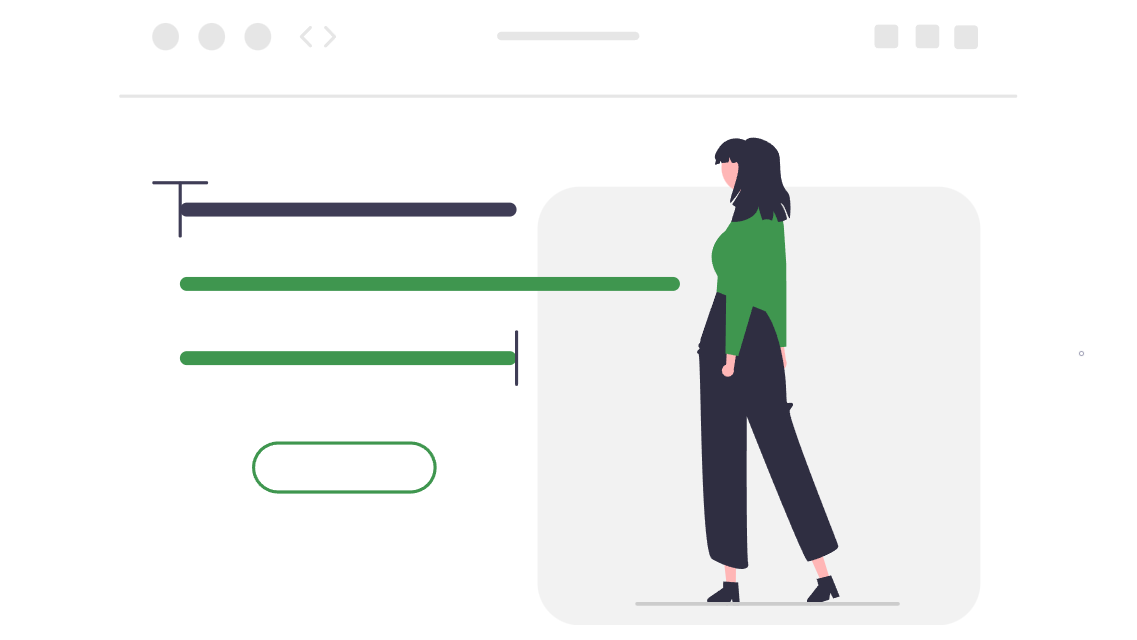
The Importance of User-Friendly Navigation
Think of your website as a physical shop. If customers enter and find themselves lost, unable to locate the products they’re after, they’re likely to leave frustrated. The same applies to your website. Poor navigation leads to high bounce rates, lost sales, and a negative brand perception. For a small business growth in Australia strategy, a well-structured website that’s easy to navigate is non-negotiable. It ensures that potential clients, whether they’re in Melbourne or further afield, can easily understand what you offer and how to engage with your business.
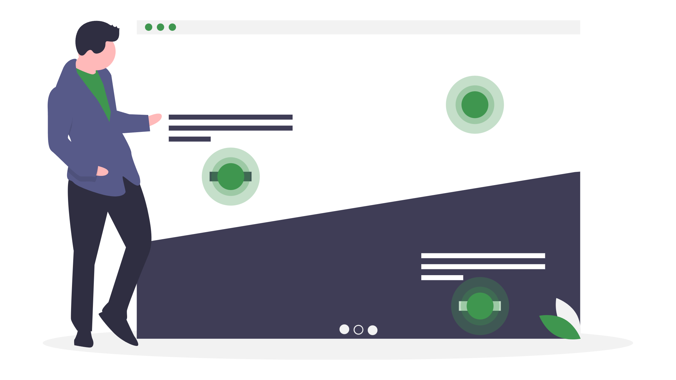
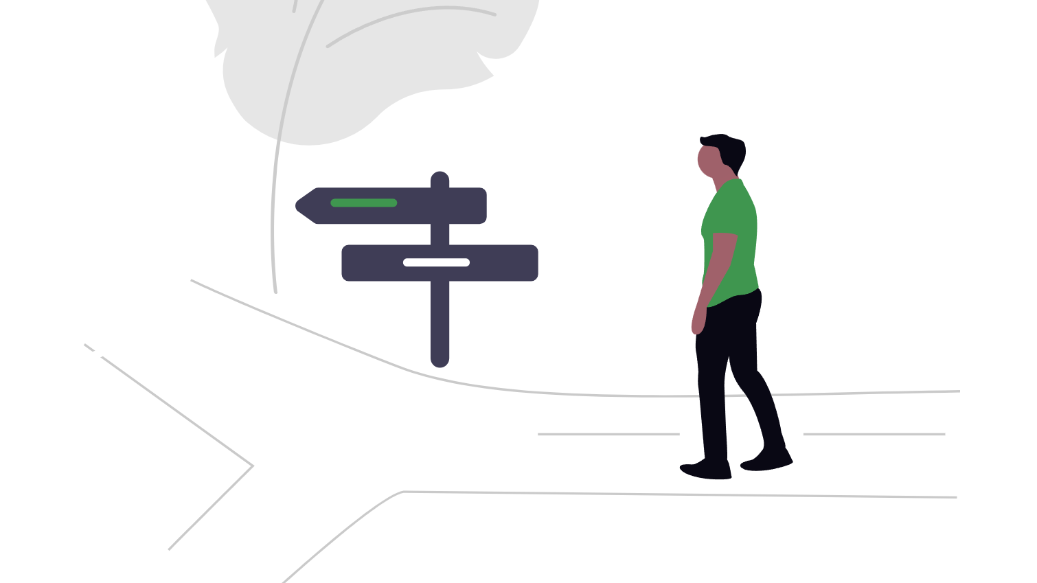
Key Principles of Intuitive Navigation
1. Simplicity is King
A clear, uncluttered navigation menu is essential. Avoid overwhelming users with too many options. Stick to the core pages that represent your main services or product categories. For instance, a Melbourne-based cafe might have a simple menu with sections like “Menu,” “About Us,” “Gallery,” and “Contact.” This straightforward approach is vital for effective website design in Melbourne. It is advisable to incorporate a breadcrumb in your website, this is essentially an additional navigation system that allows users to retrace their steps in the website, it is especially useful in more complex websites.
2. Consistency is Key
Maintain a consistent navigation structure throughout your website. The main menu should remain in the same location on every page, typically at the top or along the left-hand side. Use familiar labels like “Home,” “About,” “Services,” and “Contact.” This predictability creates a sense of familiarity and comfort for users, crucial for positive user experience and part of good responsive website design practices.
3. The “Three-Click Rule” (or Thereabouts)
Ideally, users should be able to find any piece of information within three clicks. While this isn’t a hard-and-fast rule, it highlights the importance of a shallow, logical hierarchy. Organise your content into clear categories and subcategories, making it easy for users to drill down to specific information. For example, an e-commerce website selling clothing might have categories like “Women,” “Men,” and “Kids,” with further subcategories like “Dresses,” “Trousers,” and “Shirts” under “Women.”
4. Mobile-First Approach
With the majority of web traffic now coming from mobile devices, a mobile-first approach is essential. Ensure your navigation is responsive and adapts seamlessly to different screen sizes. Hamburger menus (the three horizontal lines) are commonly used to condense navigation on smaller screens, making for a cleaner mobile experience. A web design company worth its salt will prioritise mobile responsiveness. Websites like A List Apart frequently publish articles exploring the latest trends in responsive design and mobile-first development.
5. Visual Cues and Hierarchy
Use visual cues like font size, colour, and spacing to establish a clear hierarchy within your navigation. Primary navigation items should be more prominent than secondary ones. This helps users quickly understand the structure of your website and prioritise their exploration. Proper use of visual hierarchy contributes significantly to strong brand identity. Consider if your logo design or business cards reflect a similar hierarchical structure.
6. Consider a Mega Menu
For websites with a large amount of content, a mega menu can be a useful tool. This is a large, expandable menu that reveals multiple levels of navigation at once. It can be particularly beneficial for e-commerce website platforms with extensive product catalogues. For example, a department store website might use a mega menu to display all product categories and subcategories under “Women’s Clothing,” avoiding the need for multiple clicks.
Actionable Tips for Improving Your Website Navigation
Now that we’ve covered the principles, let’s look at some practical steps you can take to improve your website’s navigation:
- Conduct User Testing: Observe how real users interact with your website. Identify any pain points or areas of confusion. Tools like heatmaps and session recordings can provide valuable insights. User testing can be crucial for identifying areas for improvement in your overall digital strategy. The Nielsen Norman Group offers a wealth of resources on usability testing and user experience research, check out their website to learn more.
- Card Sorting: This technique involves having users group your website’s content into categories that make sense to them. This can reveal valuable insights into how users naturally perceive your site’s structure.
- Analyse Website Analytics: Pay attention to metrics like bounce rate, time on page, and exit pages. High bounce rates on specific pages could indicate navigational issues. You can find valuable information and updates on how Google interprets websites in the Google Search Central Blog. Google Ads and SEO strategies are often influenced by insights gained from website analytics. You can see which pages are performing best for conversions and model other pages or improve poor-performing ones.
- Simplify Your Menu Labels: Use clear, concise language that is easily understood by your target audience. Avoid jargon or technical terms. For example, instead of “Methodology,” use “Our Approach.” This clarity aids in search engine optimisation by making your content more accessible. For in-depth articles and guides on SEO best practices, the Moz Blog is a great resource.
- Add a Search Bar: A prominent search bar allows users to quickly find what they’re looking for, especially on larger websites. This is especially helpful for users who arrive from pay-per-click advertising campaigns looking for a specific product or service.
- Use Breadcrumbs: As mentioned previously, breadcrumbs are a secondary navigation aid that shows users their current location within the website’s hierarchy. They are particularly helpful for websites with multiple levels of content.
- Create a Clear Call to Action: Guide users towards desired actions, such as making a purchase, filling out a form, or contacting you. Use clear, compelling call-to-action buttons with contrasting colours. A well-placed call to action can significantly improve your conversion rates from any digital channel, whether it’s social media marketing or email campaigns.

Hypothetical Scenarios: Navigation in Action
Let’s consider a couple of hypothetical scenarios to illustrate these principles:
Scenario 1: A Local Plumbing Business in Melbourne
A plumbing business wants to improve its website to attract more customers. Their current website has a confusing navigation structure, making it difficult for users to find information about their services or contact details.
Solution:
- Simplify the main menu to include essential pages: “Home,” “Services” (with a dropdown for specific services like “Emergency Plumbing,” “Blocked Drains,” “Hot Water Systems”), “About Us,” “Testimonials,” and “Contact.”
- Add a prominent “Request a Quote” button on every page.
- Improve local SEO by including location-specific keywords like “plumber Melbourne” in the navigation labels and page content.
- Ensure the website is mobile-friendly and loads quickly on all devices.
Scenario 2: An Online Fashion Boutique
An online fashion boutique is experiencing a high bounce rate on its product pages. Users are struggling to find the specific items they’re looking for.
Solution:
- Implement a mega menu that displays all clothing categories and subcategories in a visually appealing way.
- Add filtering options to product pages, allowing users to refine their search by size, colour, price, and other attributes.
- Use high-quality product images and detailed descriptions to entice users to explore further.
- Incorporate customer reviews and ratings to build trust and encourage purchases.
- Leverage social media management to showcase products and drive traffic to specific product pages.
Conclusion
Intuitive navigation is the cornerstone of a successful website. By implementing the principles and tips discussed in this post, Australian businesses can create websites that are a joy to use, leading to increased engagement, conversions, and ultimately, business growth. Whether you’re a small business owner in Melbourne or a larger enterprise seeking to enhance your online marketing efforts, investing in user-friendly navigation is an investment in your long-term success. It doesn’t matter if you are trying to increase the presence of your graphic design company or become a leader in the digital marketing sphere, if the navigation of your website is poor, your attempts will likely fail. Remember that your website is often the first point of contact with potential customers – make it count! By focusing on clear, consistent, and user-centric navigation, you’ll be well on your way to creating a website that not only looks great but also delivers a seamless and satisfying experience for every visitor.
For more insights into web design and digital marketing strategies, explore our blog.
Blu Mint Digital is a Melbourne-based agency specialising in website design, development, and digital marketing solutions tailored to your business needs. (blumint.com.au)