
Visual Hierarchy for Mobile: Designing for Smaller Screens
Imagine walking into a store where all the products are stacked randomly, with no clear labels or sections. You’d probably walk out, frustrated. Now, apply that scenario to your mobile website. A poorly structured site confuses visitors, driving them away before they can even engage with your content.
In today’s digital-first world, mobile usage dominates, and businesses across Australia—from Melbourne to Sydney, Perth to Brisbane—must ensure their online presence is optimised for smaller screens. But effective mobile design isn’t just about making things fit; it’s about leveraging visual hierarchy to guide users seamlessly through content and towards conversion.
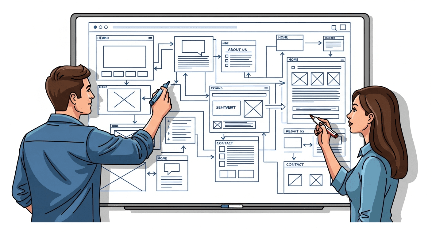
What is Visual Hierarchy in Mobile Design?
Visual hierarchy refers to the arrangement of design elements in a way that indicates importance. It dictates how users navigate a webpage, helping them focus on key messages and calls to action. Given the limited screen real estate on mobile devices, mastering visual hierarchy is essential for a successful responsive website design.
Key Elements of Visual Hierarchy for Mobile
Size and Scale
Larger elements attract more attention. Use larger fonts for headlines and key messages, while keeping body text readable (16px or larger is ideal).
Buttons should be large enough for easy tapping—around 48px in height is a good benchmark.
Contrast and Colour
High contrast between text and background improves readability and draws attention to important elements.
Use bold colours for call-to-action (CTA) buttons (e.g., “Buy Now,” “Get a Quote”) while maintaining brand consistency.
Typography and Readability
Stick to a limited number of fonts to avoid visual clutter.
Prioritise legibility by choosing fonts designed for digital screens (e.g., sans-serif fonts like Roboto or Open Sans).
Whitespace (Negative Space)
Avoid crowding elements—let your design “breathe” with ample spacing.
White space improves focus and prevents information overload, especially crucial for e-commerce websites.
Alignment and Proximity
Group related elements together (e.g., product images with descriptions and price tags).
Align content to a grid structure to maintain consistency across different screen sizes.
Directional Cues
Use arrows, icons, or animations to subtly guide users towards actions.
People naturally read in an “F” or “Z” pattern—design accordingly to highlight key content.
Mobile-Friendly Navigation
Opt for intuitive menus, such as a hamburger menu for complex sites.
Sticky navigation bars ensure essential options (like “Call Us” or “Book Now”) remain accessible.
Actionable Tips for Enhancing Mobile Visual Hierarchy
1. Prioritise the Most Important Content
Not all content deserves equal weight. Identify the core message of your digital marketing strategy and ensure it’s front and centre. Whether you’re offering pay-per-click advertising, SEO services, or website development, make it clear what sets your business apart.
2. Test and Optimise for Touch
Unlike desktops, mobile users rely on touch, not clicks. Ensure:
Buttons are large enough to tap without frustration.
There’s enough spacing between clickable elements to avoid misclicks.
Forms are simplified—only ask for essential information.
3. Use Mobile-Friendly Images and Videos
Heavy media files slow down load times, affecting SEO rankings. Optimise images for web by:
Compressing files without losing quality.
Using next-gen formats like WebP.
Enabling lazy loading to defer offscreen images.
4. Enhance Readability with Scannable Content
People skim on mobile. Improve content readability with:
Short paragraphs (2-3 sentences each).
Bullet points for easy scanning.
Subheadings that clearly indicate what each section covers.
5. Leverage A/B Testing and Analytics
Test different visual hierarchies using tools like Google Analytics or heatmaps. A/B testing can reveal which layouts drive higher engagement and conversions.
Future-Proofing Your Mobile Design Strategy
With Google prioritising mobile-first indexing, businesses that fail to optimise their visual hierarchy risk losing visibility in search rankings. A strategic digital presence ensures your brand remains competitive in a fast-evolving landscape.
Final Thoughts
Great mobile design isn’t just about aesthetics—it’s about function. By applying effective visual hierarchy principles, businesses across Australia can create seamless, engaging experiences that drive conversions. Whether you’re in Melbourne, Sydney, Perth, or beyond, optimising for mobile is no longer optional—it’s essential for success in today’s digital marketplace.
Want to stay ahead in the ever-evolving world of digital marketing? Implement these tips today and watch your online presence thrive!
Sources
For more insights into web design and digital marketing strategies, explore our blog.
Blu Mint Digital is a Melbourne-based agency specialising in website design, development, and digital marketing solutions tailored to your business needs. (blumint.com.au)

FAQ
FAQ
01
What does the website design process involve?
02
How long does a typical project take to complete?
03
Can you help improve our search engine rankings?
04
How do we track the success of our digital campaign?
05
What’s included in your branding services?
06
Will our website be mobile-friendly?
07
How do we update our website after launch?
08
Do you offer ongoing maintenance and support?
Visual Hierarchy for Mobile: Designing for Smaller Screens
Imagine walking into a store where all the products are stacked randomly, with no clear labels or sections. You’d probably walk out, frustrated. Now, apply that scenario to your mobile website. A poorly structured site confuses visitors, driving them away before they can even engage with your content.
In today’s digital-first world, mobile usage dominates, and businesses across Australia—from Melbourne to Sydney, Perth to Brisbane—must ensure their online presence is optimised for smaller screens. But effective mobile design isn’t just about making things fit; it’s about leveraging visual hierarchy to guide users seamlessly through content and towards conversion.
What is Visual Hierarchy in Mobile Design?
Visual hierarchy refers to the arrangement of design elements in a way that indicates importance. It dictates how users navigate a webpage, helping them focus on key messages and calls to action. Given the limited screen real estate on mobile devices, mastering visual hierarchy is essential for a successful responsive website design.
Key Elements of Visual Hierarchy for Mobile
Size and Scale
Larger elements attract more attention. Use larger fonts for headlines and key messages, while keeping body text readable (16px or larger is ideal).
Buttons should be large enough for easy tapping—around 48px in height is a good benchmark.
Contrast and Colour
High contrast between text and background improves readability and draws attention to important elements.
Use bold colours for call-to-action (CTA) buttons (e.g., “Buy Now,” “Get a Quote”) while maintaining brand consistency.
Typography and Readability
Stick to a limited number of fonts to avoid visual clutter.
Prioritise legibility by choosing fonts designed for digital screens (e.g., sans-serif fonts like Roboto or Open Sans).
Whitespace (Negative Space)
Avoid crowding elements—let your design “breathe” with ample spacing.
White space improves focus and prevents information overload, especially crucial for e-commerce websites.
Alignment and Proximity
Group related elements together (e.g., product images with descriptions and price tags).
Align content to a grid structure to maintain consistency across different screen sizes.
Directional Cues
Use arrows, icons, or animations to subtly guide users towards actions.
People naturally read in an “F” or “Z” pattern—design accordingly to highlight key content.
Mobile-Friendly Navigation
Opt for intuitive menus, such as a hamburger menu for complex sites.
Sticky navigation bars ensure essential options (like “Call Us” or “Book Now”) remain accessible.
Actionable Tips for Enhancing Mobile Visual Hierarchy
1. Prioritise the Most Important Content
Not all content deserves equal weight. Identify the core message of your digital marketing strategy and ensure it’s front and centre. Whether you’re offering pay-per-click advertising, SEO services, or website development, make it clear what sets your business apart.
2. Test and Optimise for Touch
Unlike desktops, mobile users rely on touch, not clicks. Ensure:
Buttons are large enough to tap without frustration.
There’s enough spacing between clickable elements to avoid misclicks.
Forms are simplified—only ask for essential information.
3. Use Mobile-Friendly Images and Videos
Heavy media files slow down load times, affecting SEO rankings. Optimise images for web by:
Compressing files without losing quality.
Using next-gen formats like WebP.
Enabling lazy loading to defer offscreen images.
4. Enhance Readability with Scannable Content
People skim on mobile. Improve content readability with:
Short paragraphs (2-3 sentences each).
Bullet points for easy scanning.
Subheadings that clearly indicate what each section covers.
5. Leverage A/B Testing and Analytics
Test different visual hierarchies using tools like Google Analytics or heatmaps. A/B testing can reveal which layouts drive higher engagement and conversions.
Future-Proofing Your Mobile Design Strategy
With Google prioritising mobile-first indexing, businesses that fail to optimise their visual hierarchy risk losing visibility in search rankings. A strategic digital presence ensures your brand remains competitive in a fast-evolving landscape.
Final Thoughts
Great mobile design isn’t just about aesthetics—it’s about function. By applying effective visual hierarchy principles, businesses across Australia can create seamless, engaging experiences that drive conversions. Whether you’re in Melbourne, Sydney, Perth, or beyond, optimising for mobile is no longer optional—it’s essential for success in today’s digital marketplace.
Want to stay ahead in the ever-evolving world of digital marketing? Implement these tips today and watch your online presence thrive!
Sources
For more insights into web design and digital marketing strategies, explore our blog.
Blu Mint Digital is a Melbourne-based agency specialising in website design, development, and digital marketing solutions tailored to your business needs. (blumint.com.au)
FAQ
01
What does the website design process involve?
02
How long does a typical project take to complete?
03
Can you help improve our search engine rankings?
04
How do we track the success of our digital campaign?
05
What’s included in your branding services?
06
Will our website be mobile-friendly?
07
How do we update our website after launch?
08
Do you offer ongoing maintenance and support?
Visual Hierarchy for Mobile: Designing for Smaller Screens
Imagine walking into a store where all the products are stacked randomly, with no clear labels or sections. You’d probably walk out, frustrated. Now, apply that scenario to your mobile website. A poorly structured site confuses visitors, driving them away before they can even engage with your content.
In today’s digital-first world, mobile usage dominates, and businesses across Australia—from Melbourne to Sydney, Perth to Brisbane—must ensure their online presence is optimised for smaller screens. But effective mobile design isn’t just about making things fit; it’s about leveraging visual hierarchy to guide users seamlessly through content and towards conversion.
What is Visual Hierarchy in Mobile Design?
Visual hierarchy refers to the arrangement of design elements in a way that indicates importance. It dictates how users navigate a webpage, helping them focus on key messages and calls to action. Given the limited screen real estate on mobile devices, mastering visual hierarchy is essential for a successful responsive website design.
Key Elements of Visual Hierarchy for Mobile
Size and Scale
Larger elements attract more attention. Use larger fonts for headlines and key messages, while keeping body text readable (16px or larger is ideal).
Buttons should be large enough for easy tapping—around 48px in height is a good benchmark.
Contrast and Colour
High contrast between text and background improves readability and draws attention to important elements.
Use bold colours for call-to-action (CTA) buttons (e.g., “Buy Now,” “Get a Quote”) while maintaining brand consistency.
Typography and Readability
Stick to a limited number of fonts to avoid visual clutter.
Prioritise legibility by choosing fonts designed for digital screens (e.g., sans-serif fonts like Roboto or Open Sans).
Whitespace (Negative Space)
Avoid crowding elements—let your design “breathe” with ample spacing.
White space improves focus and prevents information overload, especially crucial for e-commerce websites.
Alignment and Proximity
Group related elements together (e.g., product images with descriptions and price tags).
Align content to a grid structure to maintain consistency across different screen sizes.
Directional Cues
Use arrows, icons, or animations to subtly guide users towards actions.
People naturally read in an “F” or “Z” pattern—design accordingly to highlight key content.
Mobile-Friendly Navigation
Opt for intuitive menus, such as a hamburger menu for complex sites.
Sticky navigation bars ensure essential options (like “Call Us” or “Book Now”) remain accessible.
Actionable Tips for Enhancing Mobile Visual Hierarchy
1. Prioritise the Most Important Content
Not all content deserves equal weight. Identify the core message of your digital marketing strategy and ensure it’s front and centre. Whether you’re offering pay-per-click advertising, SEO services, or website development, make it clear what sets your business apart.
2. Test and Optimise for Touch
Unlike desktops, mobile users rely on touch, not clicks. Ensure:
Buttons are large enough to tap without frustration.
There’s enough spacing between clickable elements to avoid misclicks.
Forms are simplified—only ask for essential information.
3. Use Mobile-Friendly Images and Videos
Heavy media files slow down load times, affecting SEO rankings. Optimise images for web by:
Compressing files without losing quality.
Using next-gen formats like WebP.
Enabling lazy loading to defer offscreen images.
4. Enhance Readability with Scannable Content
People skim on mobile. Improve content readability with:
Short paragraphs (2-3 sentences each).
Bullet points for easy scanning.
Subheadings that clearly indicate what each section covers.
5. Leverage A/B Testing and Analytics
Test different visual hierarchies using tools like Google Analytics or heatmaps. A/B testing can reveal which layouts drive higher engagement and conversions.
Future-Proofing Your Mobile Design Strategy
With Google prioritising mobile-first indexing, businesses that fail to optimise their visual hierarchy risk losing visibility in search rankings. A strategic digital presence ensures your brand remains competitive in a fast-evolving landscape.
Final Thoughts
Great mobile design isn’t just about aesthetics—it’s about function. By applying effective visual hierarchy principles, businesses across Australia can create seamless, engaging experiences that drive conversions. Whether you’re in Melbourne, Sydney, Perth, or beyond, optimising for mobile is no longer optional—it’s essential for success in today’s digital marketplace.
Want to stay ahead in the ever-evolving world of digital marketing? Implement these tips today and watch your online presence thrive!
Sources
For more insights into web design and digital marketing strategies, explore our blog.
Blu Mint Digital is a Melbourne-based agency specialising in website design, development, and digital marketing solutions tailored to your business needs. (blumint.com.au)
FAQ
What does the website design process involve?
How long does a typical project take to complete?
Can you help improve our search engine rankings?
How do we track the success of our digital campaign?
What’s included in your branding services?
Will our website be mobile-friendly?
How do we update our website after launch?
Do you offer ongoing maintenance and support?